


Is our taste evolving post/past minimalism? Art direction review.
The unraveling of the overly simplistic design system.

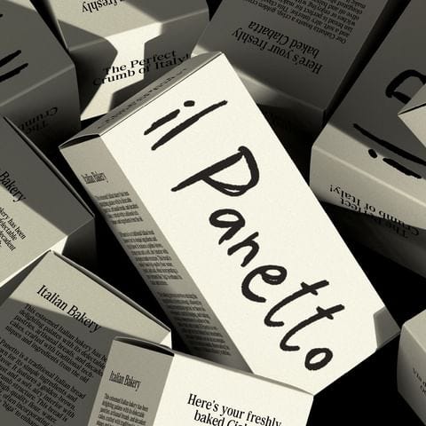
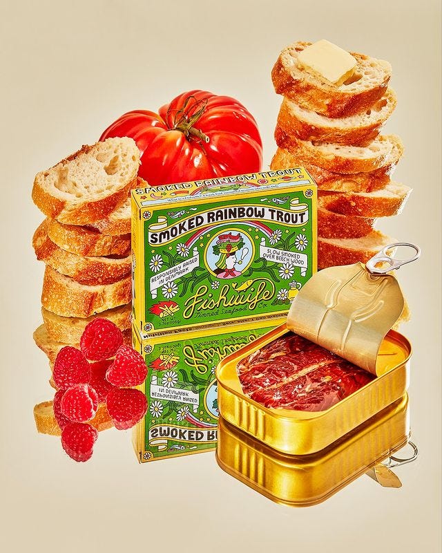
Product & package design is becoming more “creative” again - thankfully. Meaning - more eclectic, unique, distinguishable, signature, one-of-one, and beautiful. With references to heritage, nostalgia, a place in time, & a story to tell. Let me contextualize what I feel we are coming out of.
Some call it the sea of sameness. We saw brands making their logos and typography more stripped down. Less was more, and Helvetica was everywhere. Brands had been dubbed “blands” due to their design & color palettes that were, simple/neutral. This look & feel was unisex & applicable to a wider audience. But at what costs?


I can’t believe these are real
What I found particularly odd was how simple design was used to convey a sense of naturalness. The notion that fewer ingredients are a good thing (which can be true) - was conveyed through minimalism. But does minimalism feel - “natural?” No, it conveys luxury.


When you think of nature, it’s the least minimal thing possible. It’s the most maximalist thing you could imagine. There are no grids, there’s no straight lines. It’s complete chaos - and it’s freaking awesome.

But we do have a notion of what a “natural product” looks like. That is farmer’s market products or local grocery products. Aka, the good stuff with bad graphic design. Pictures of clipart leaves, bad fonts, unclear design systems, and no real identity. Small batch goods, handwritten notes, and Sharpie labels. In most cases, those products are probably the best for you. This is likely the result of no real design budget but full emphasis on the product. Which comes from locally run organizations with oftentimes an aging operator who doesn’t care about this type of stuff.
It’s clear there is a demand to make luxury versions of those items at scale. And mainly because you can sell them for 10X the price. So, if you have a “natural” looking product and then you have a luxury-looking product (minimal) of the same product:
You’re selling the brand and the marketing, and you’re trying to find someone looking to buy as a reflection of their aspirations and design sensibilities. Enter the most expensive two grocery stores you can imagine below.


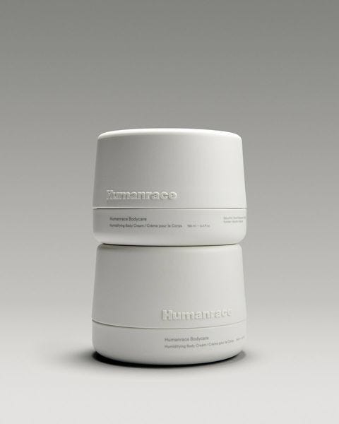
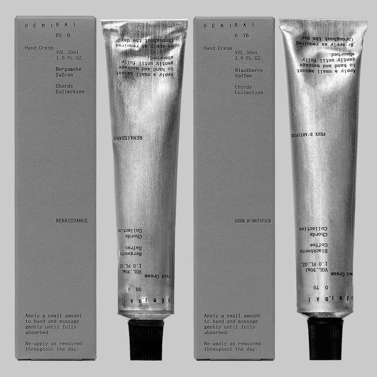
At one point, Aesop, Grown Alchemist, and Le Labo innovated on minimal design principles and created products well above the remainder of the market in brand equity. They’ve set the standard for luxury product design backed by quality, natural formulations. They’re used without fail in every personal care brand competition chart. And what those brands have built is incredible.
But, I see the evolution of post-minimalism (ubiquitous high-society design) and feel there is a white space available to create signature (eclectic/cultured) package designs that look like sculptural art pieces that can be paired with timeless typographic accents.
All of the above will be factored into the Firsthand Brand Refresh - come late summer which I’m working on with Parker Studio.
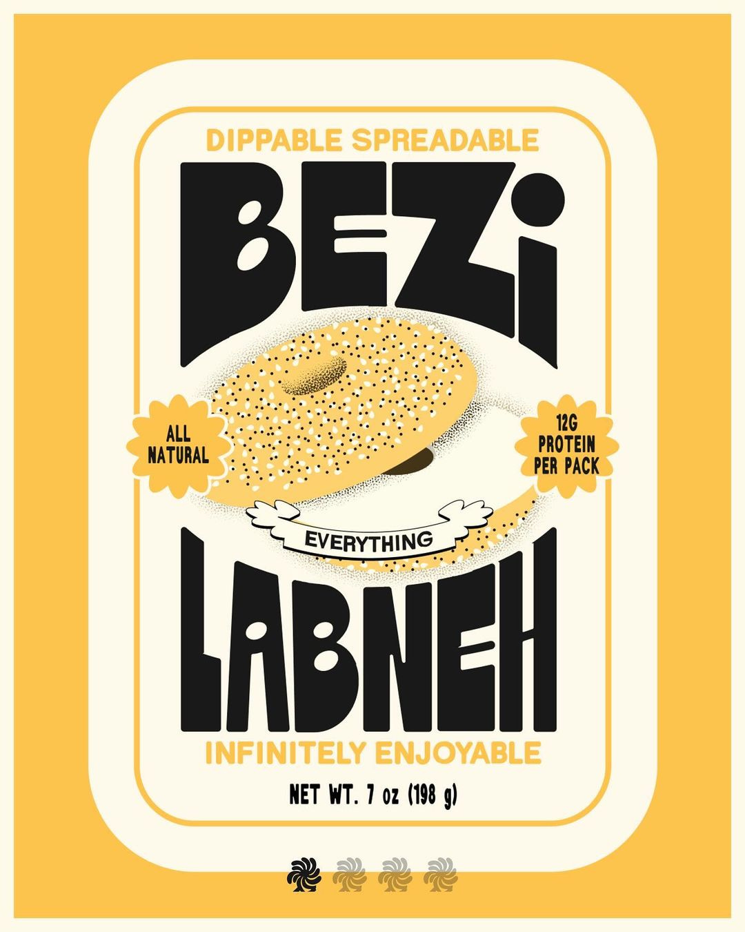
See some stuff that’s been catching my eye below :)


Good design is always a risk and is often initially met with criticism if truly innovative. But I feel the space for newness: exciting, recognizable, and inviting design. I see the opportunity for brands to make products that will become case studies for years to come and the next-gen of MBA materials taught about creative & marketing in 2025.
Till next time!

nailed it. i'm very happy to see some life and originality coming back into design. Minimalism worked very well in some cases (and still does) but it became oversaturated in the design realm because at times, what can be described as 'lazy design' became acceptable—i'm even guilty of overusing it myself.
I’m ready for it! As a former fan of “blanding” please God let’s experience some branding 🙏🙏🙏🙏